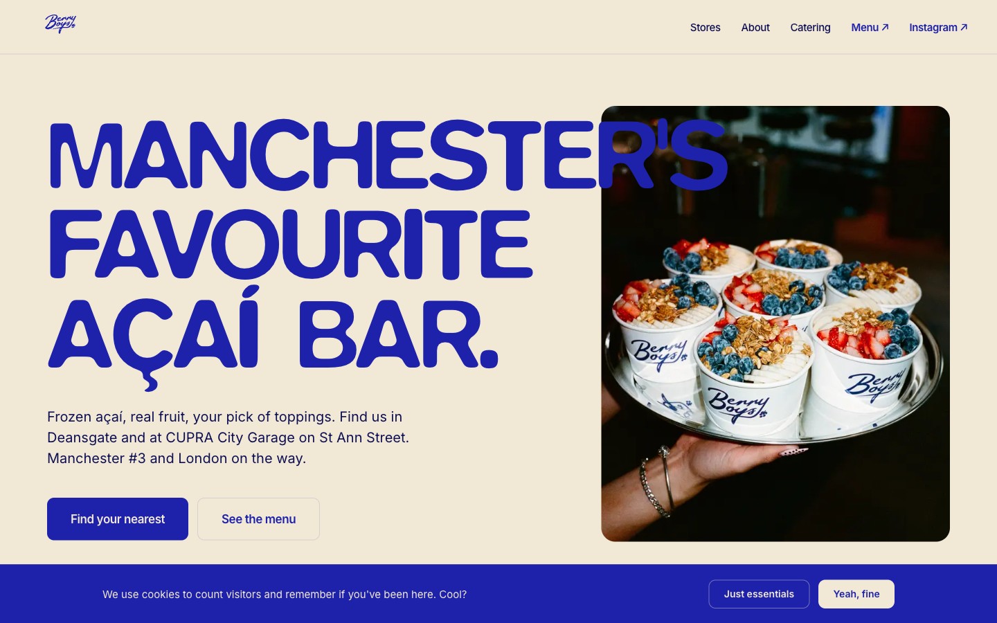
Brief
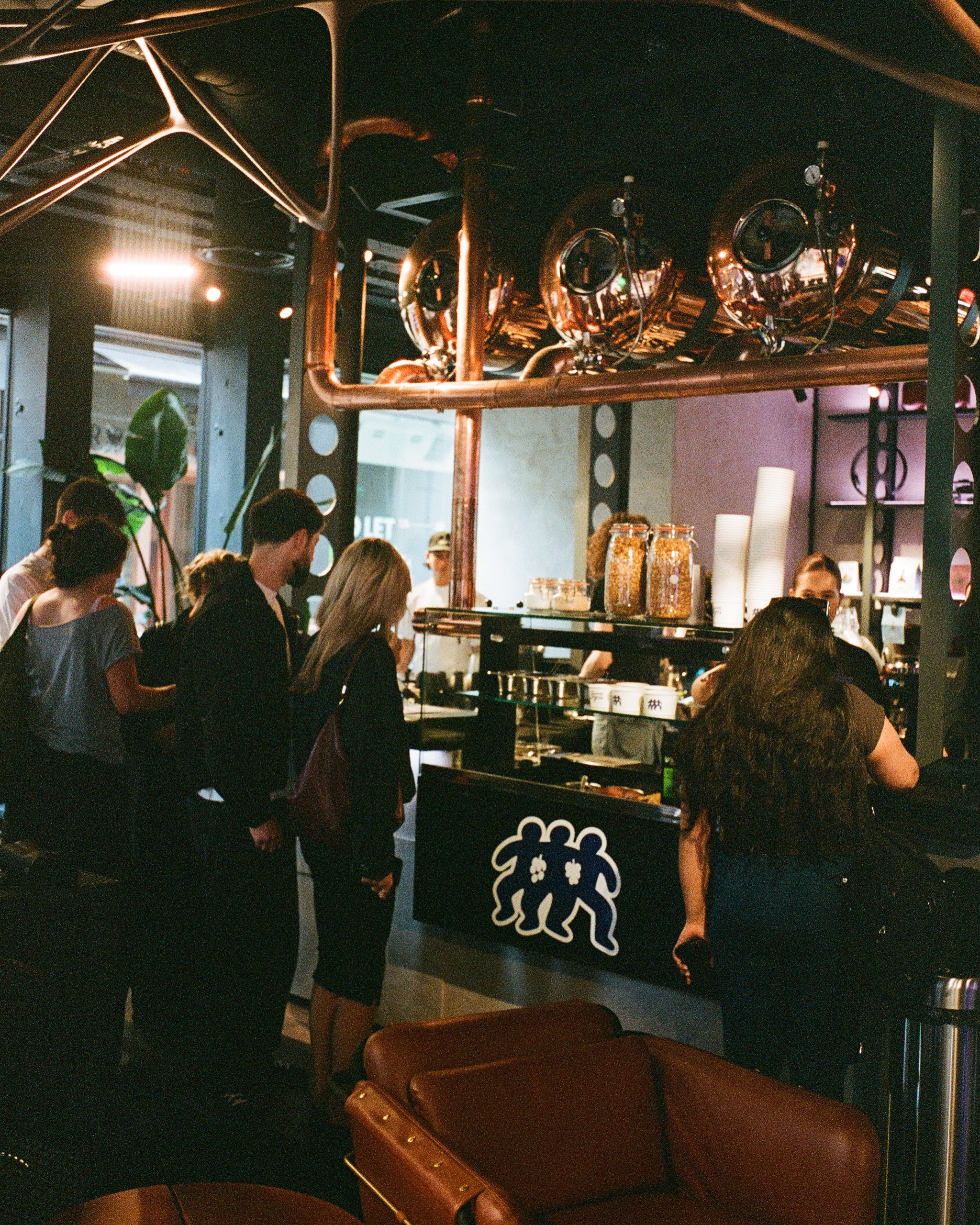
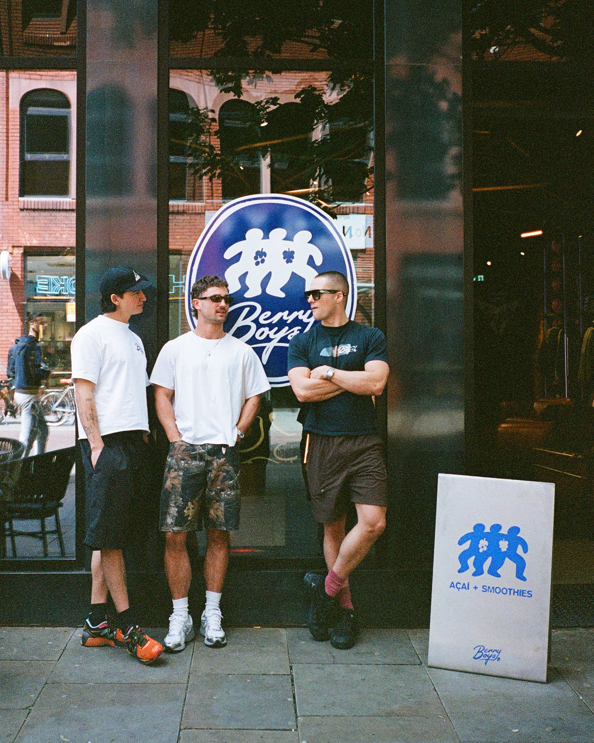
Berry Boys is an açaí bar run by three Manchester mates, Josh, Finn, and Harry, who started it on a whim with no hospitality experience and turned it into one of the city's most talked-about food brands. By the time they came to us the whole business lived on Instagram. Two stores were open, Deansgate and the CUPRA City Garage, more were on the way, and London was being teased to a fast-growing audience. They had a sharp, fully formed brand and nowhere of their own to put it.
The brief was specific. Build the first home off Instagram. Make it scale as the stores multiply. And carry the brand voice as well as the feed does, because a generic restaurant site would have undersold everything that makes Berry Boys worth a detour.
Approach
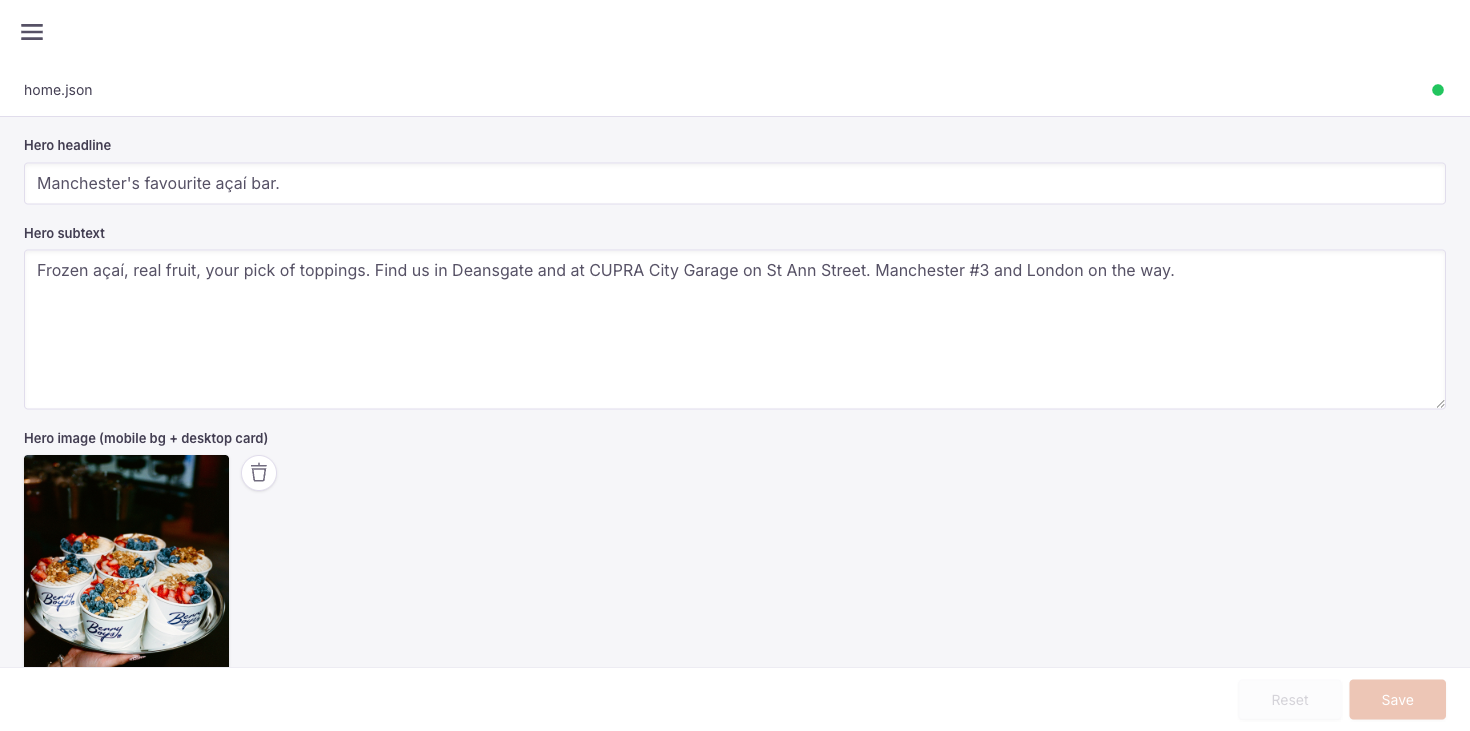
We built a brand-faithful marketing site in Next.js: a home that leads with the brand, a full menu, an about page that tells the three-mates story properly, a catering enquiry flow, and a stores section built to grow. Each store gets its own page, the index adds new locations without a redesign, and a running "next store" tease keeps the London momentum on the site instead of only on the feed.
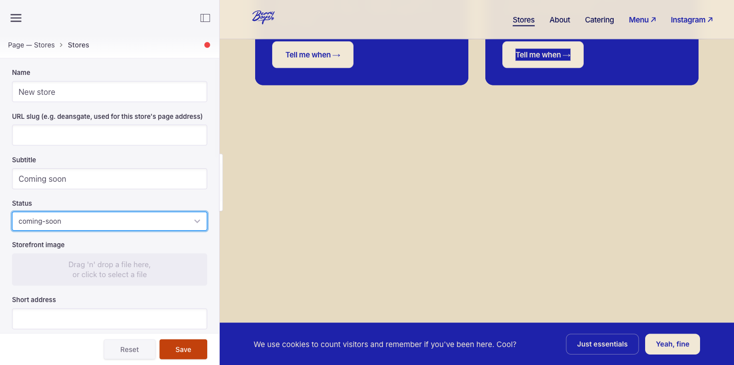
The part that matters most sits behind the scenes. We wired the whole site to a self-hosted, fully white-labelled content system so the founders run it themselves. They edit every page, add a new store, change opening hours day by day, swap photography, and publish, all without touching code or waiting on us. A focal-point picker lets them click any image to choose what stays in frame across every crop. Three of them can log in and edit. The admin is branded as theirs, not the tool's.
Around that, waitlist and catering enquiries are captured straight to a database rather than landing in a DM. Transactional emails were rewritten in the Berry Boys voice. The site ships with full SEO, structured data for each store, consent-gated analytics, and the legal pages a registered company needs.
Brand integration
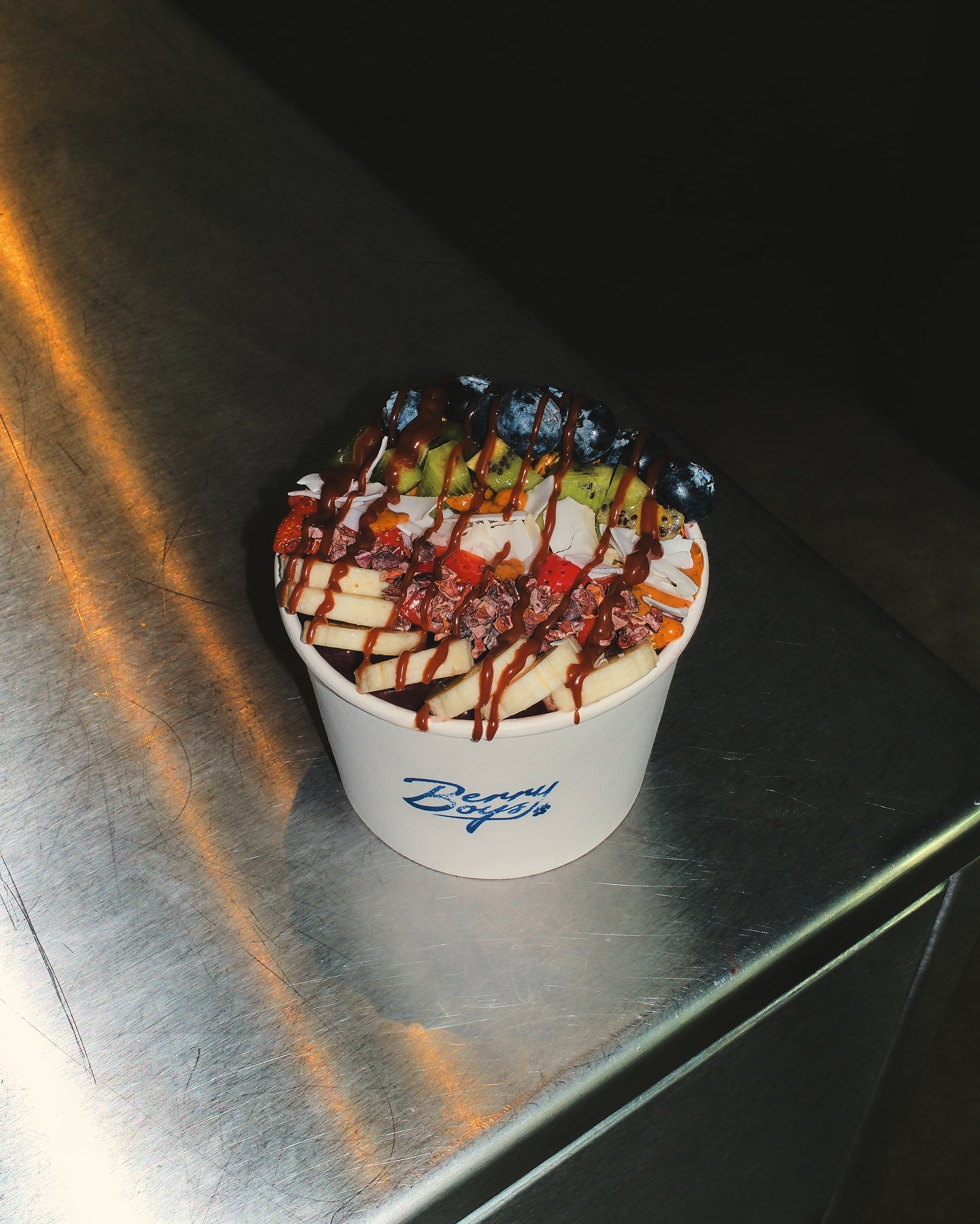
The brand was already strong, so our job was to honour it, not reinvent it. The site holds faithfully to the locked cobalt and cream duotone, Blur for the chunky display headlines, Inter for the body, and the hand-lettered script wordmark used only as a mark, never as running text. Cream is the paper, cobalt is the ink, and the bold poster feeling from the Instagram grid carries straight onto the homepage above the fold. It reads as Berry Boys from the first scroll.